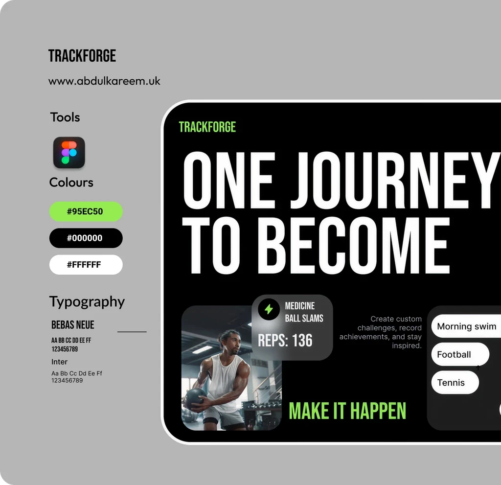
TRACKFORGE
Overview
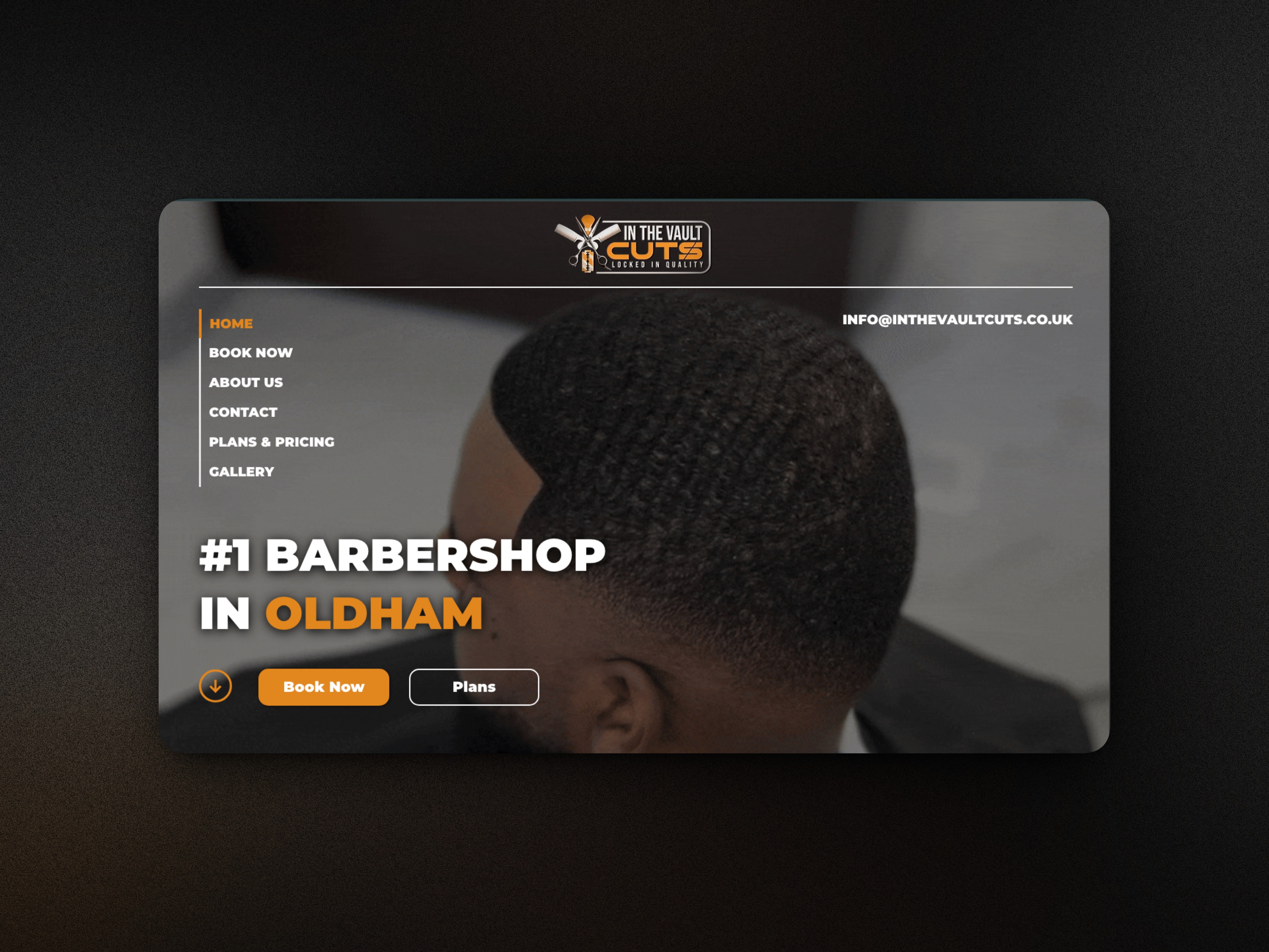
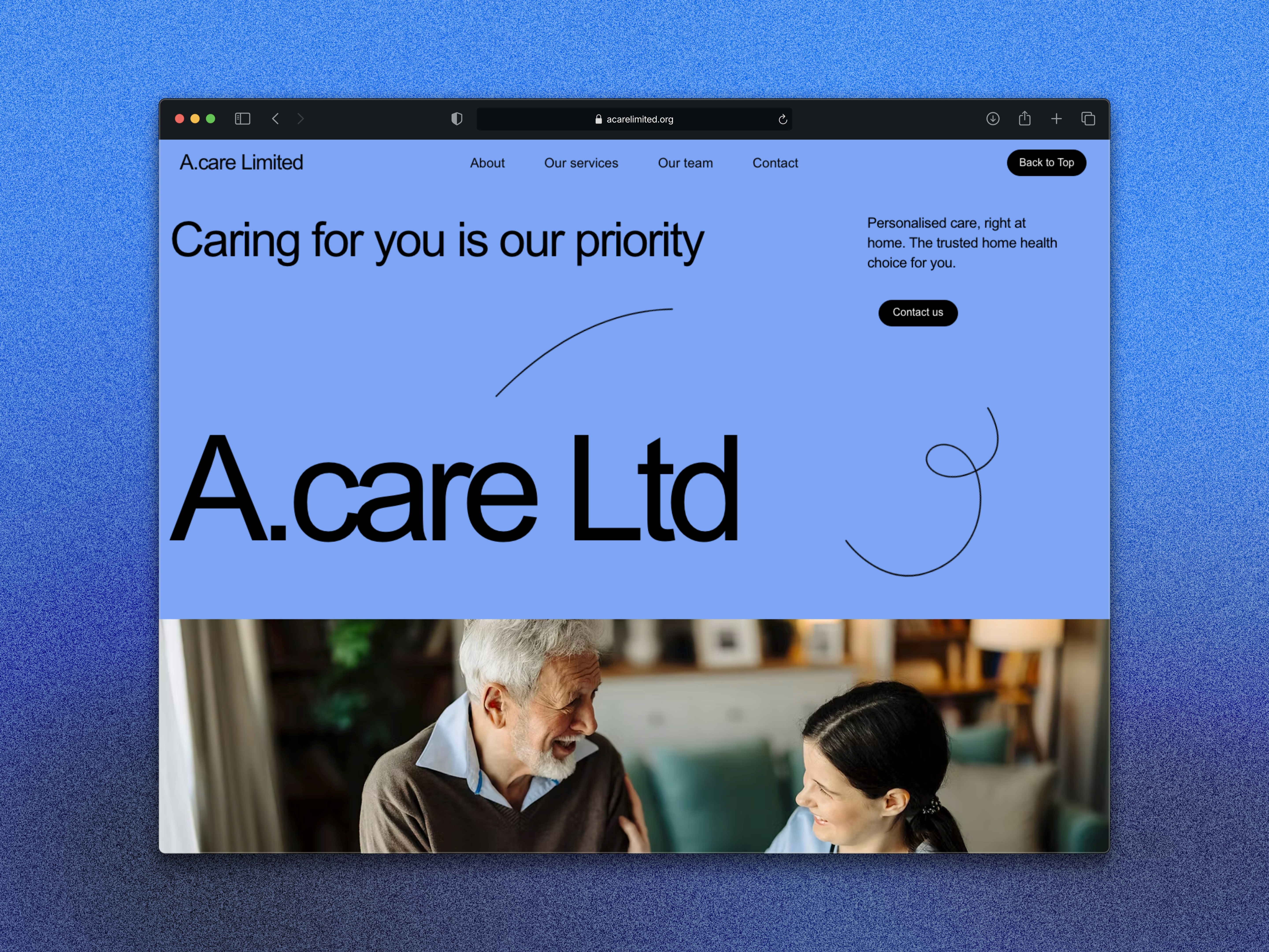
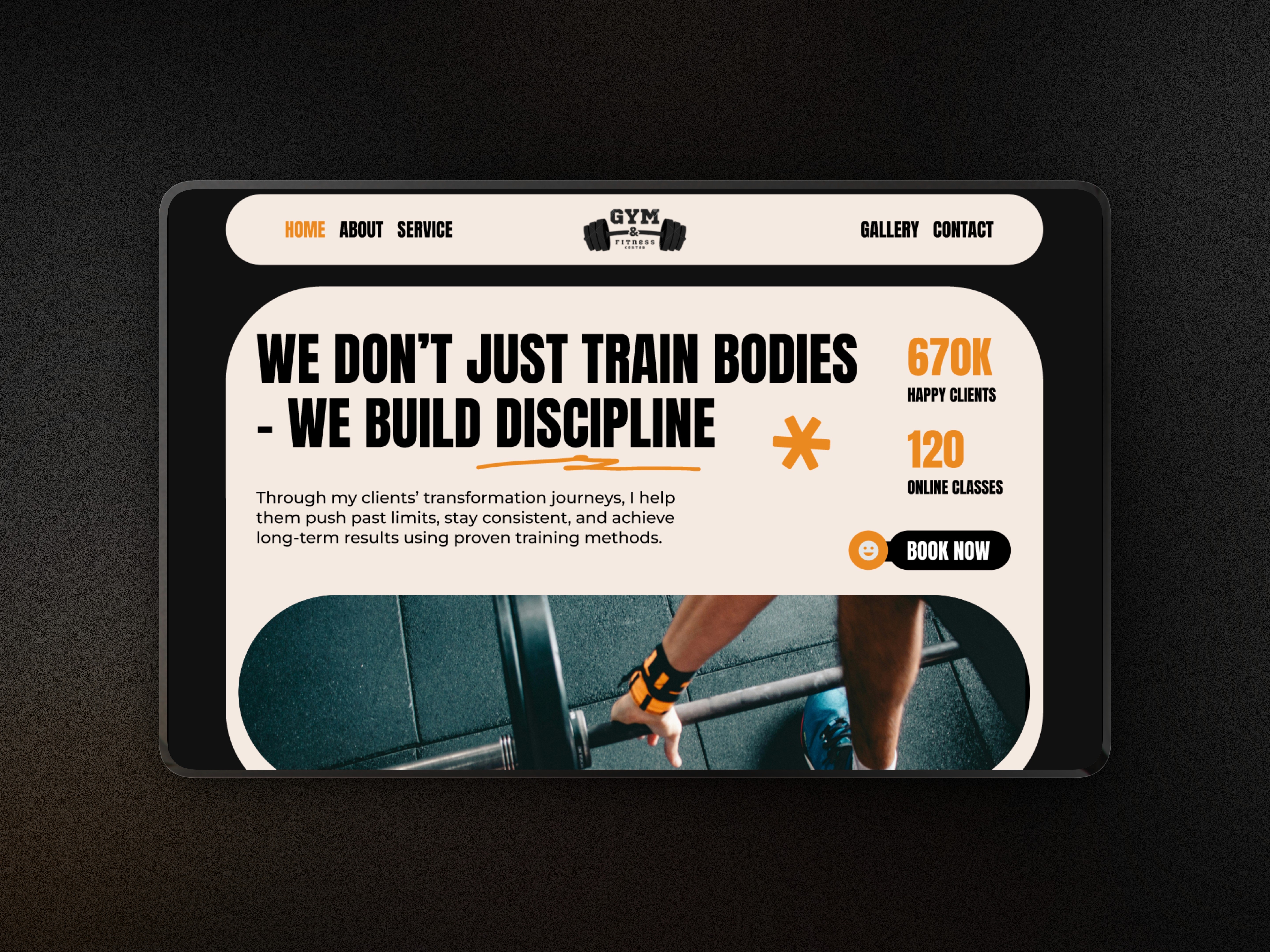
TrackForge is a personal concept project focused on designing a bold, modern hero section for a fitness coaching brand. The aim was to practise building high-impact layouts that communicate value instantly while refining my skills in visual hierarchy, typography, and digital branding for service-based businesses.
Project type
Figma Project
Fitness
Year
2025
Client

UX Case Study
The Problem
Many fitness hero sections struggle with unclear messaging, weak visuals, or poor structure, making it difficult for users to understand what the trainer offers at first glance. I wanted to design a hero that fixes these issues—strong headline, clear call-to-action, and visuals that instantly communicate strength, discipline, and transformation.
The Goal
Craft a powerful first impression that motivates users to engage.
Build a hero layout that showcases fitness coaching in a confident, professional way.
Strengthen my skills in modern typography, spacing, and layout composition.
Explore a bold, energetic visual system that fits the fitness industry.
Design a hero section that could easily scale into a full landing page.
My Approach
I started by defining a core message for TrackForge—strength, discipline, and progress. From that, I explored bold headline styles, dynamic colour accents, and imagery that reinforces movement and performance.
Key decisions included:
Using strong, condensed typography for impact.
Introducing high-contrast colours to create energy and focus.
Designing clear CTAs to encourage users to start their coaching journey.
Incorporating subtle modern touches such as rounded cards, overlays, or grid alignment to create a clean and professional look.
The Solution
The final hero section features:
A bold headline that communicates the mission instantly.
A clean subheading that explains the value in one glance.
A strong CTA positioned for quick conversions.
High-energy imagery to reinforce the message visually.
A modern colour palette aligned with the fitness industry.
A structured layout designed for fast scanning and engagement.
The result is a dynamic hero section that looks professional, modern, and conversion-focused.
Outcome
This project allowed me to sharpen my hero-section design skills and explore how to turn a fitness coaching idea into a visually confident digital brand. TrackForge now stands as a strong portfolio piece showcasing my ability to design bold, modern hero sections built for real-world service businesses.
TRACKFORGE
Overview
TrackForge is a personal concept project focused on designing a bold, modern hero section for a fitness coaching brand. The aim was to practise building high-impact layouts that communicate value instantly while refining my skills in visual hierarchy, typography, and digital branding for service-based businesses.
Project type
Figma Project
Fitness
Year
2025
Client
UX Case Study
The Problem
Many fitness hero sections struggle with unclear messaging, weak visuals, or poor structure, making it difficult for users to understand what the trainer offers at first glance. I wanted to design a hero that fixes these issues—strong headline, clear call-to-action, and visuals that instantly communicate strength, discipline, and transformation.
The Goal
Craft a powerful first impression that motivates users to engage.
Build a hero layout that showcases fitness coaching in a confident, professional way.
Strengthen my skills in modern typography, spacing, and layout composition.
Explore a bold, energetic visual system that fits the fitness industry.
Design a hero section that could easily scale into a full landing page.
My Approach
I started by defining a core message for TrackForge—strength, discipline, and progress. From that, I explored bold headline styles, dynamic colour accents, and imagery that reinforces movement and performance.
Key decisions included:
Using strong, condensed typography for impact.
Introducing high-contrast colours to create energy and focus.
Designing clear CTAs to encourage users to start their coaching journey.
Incorporating subtle modern touches such as rounded cards, overlays, or grid alignment to create a clean and professional look.
The Solution
The final hero section features:
A bold headline that communicates the mission instantly.
A clean subheading that explains the value in one glance.
A strong CTA positioned for quick conversions.
High-energy imagery to reinforce the message visually.
A modern colour palette aligned with the fitness industry.
A structured layout designed for fast scanning and engagement.
The result is a dynamic hero section that looks professional, modern, and conversion-focused.
Outcome
This project allowed me to sharpen my hero-section design skills and explore how to turn a fitness coaching idea into a visually confident digital brand. TrackForge now stands as a strong portfolio piece showcasing my ability to design bold, modern hero sections built for real-world service businesses.
What's more :