SPECTRA
Overview
Spectra is a personal concept project created to refine my UI design skills and explore modern hero-section layouts. The aim was to design a clean, bold, and visually engaging hero that demonstrates strong hierarchy, balanced spacing, and a premium aesthetic suitable for a digital-first brand.
Project type
Figma Project
Optical Industry
Year
2025
Client


UX Case Study
The Problem
I wanted to challenge myself to create a hero section that feels modern, structured, and instantly impactful. Many beginner hero designs suffer from cluttered layouts, weak hierarchy, and generic visuals. This project allowed me to practice solving those problems through thoughtful UI decisions.
The Goal
Strengthen my ability to design visually strong hero sections.
Focus on typography, spacing, and layout hierarchy.
Build a clean, minimal aesthetic with premium appeal.
Practice creating CTAs that stand out without overpowering the design.
Ensure the design works smoothly across desktop and mobile.
My Approach
I started by defining a simple message and structuring the layout around it. I explored different typographic scales, spacing systems, and layout compositions to create a clear flow for the user. I experimented with subtle gradients and soft geometric shapes to bring depth without crowding the interface.
The design process involved iterating through several wireframes, refining hierarchy, and ensuring that every element had a purpose and visual balance.
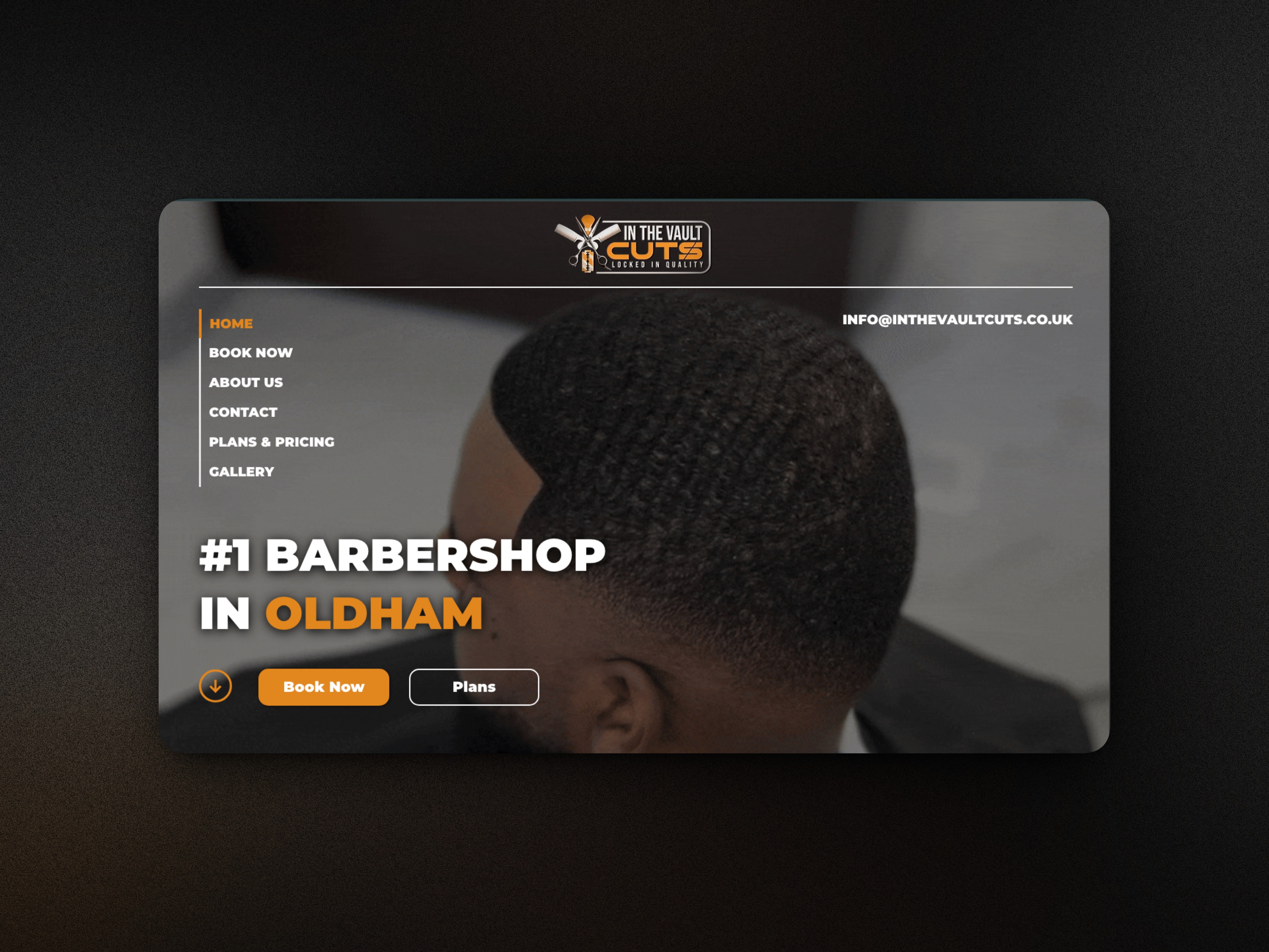
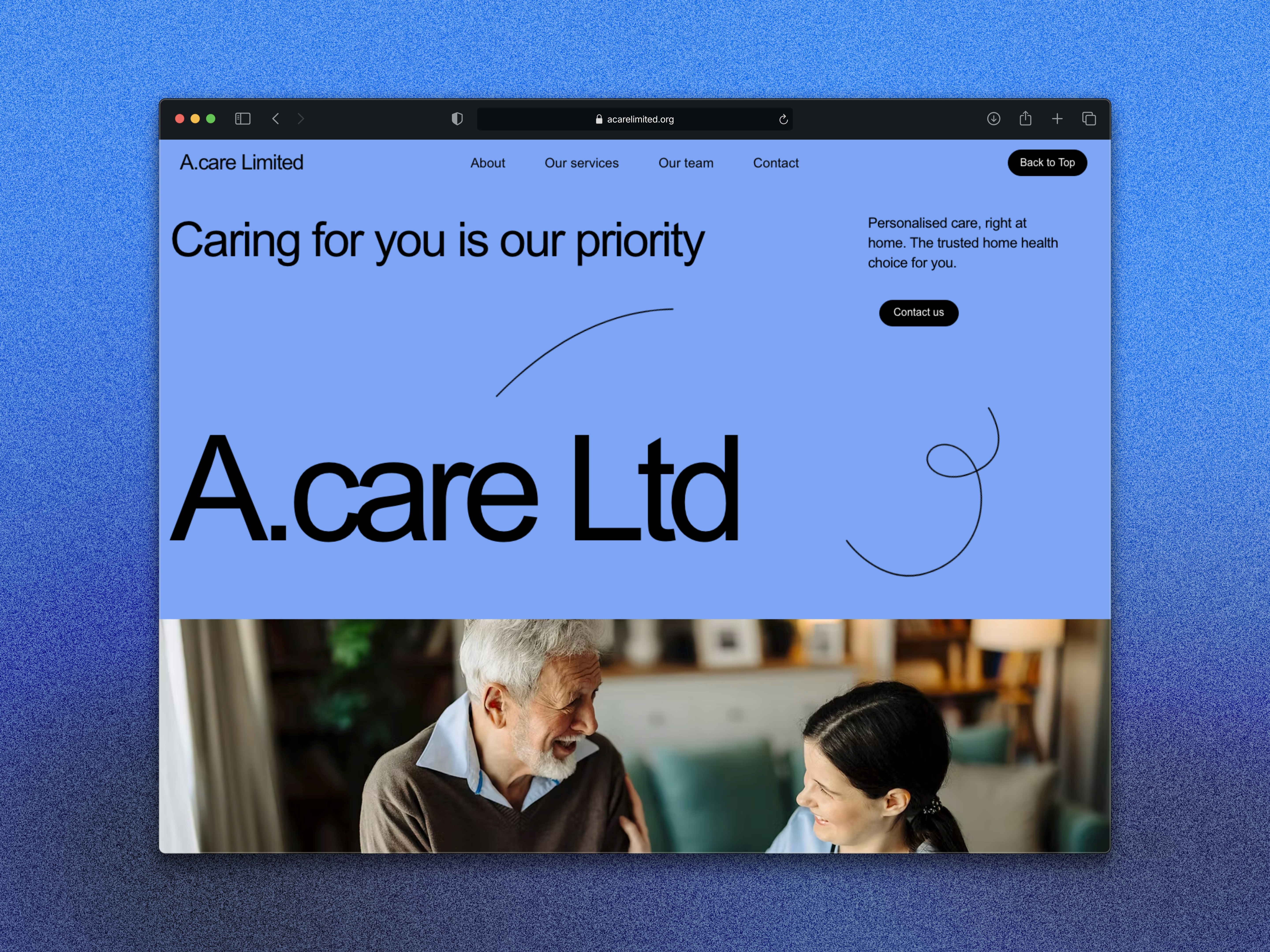
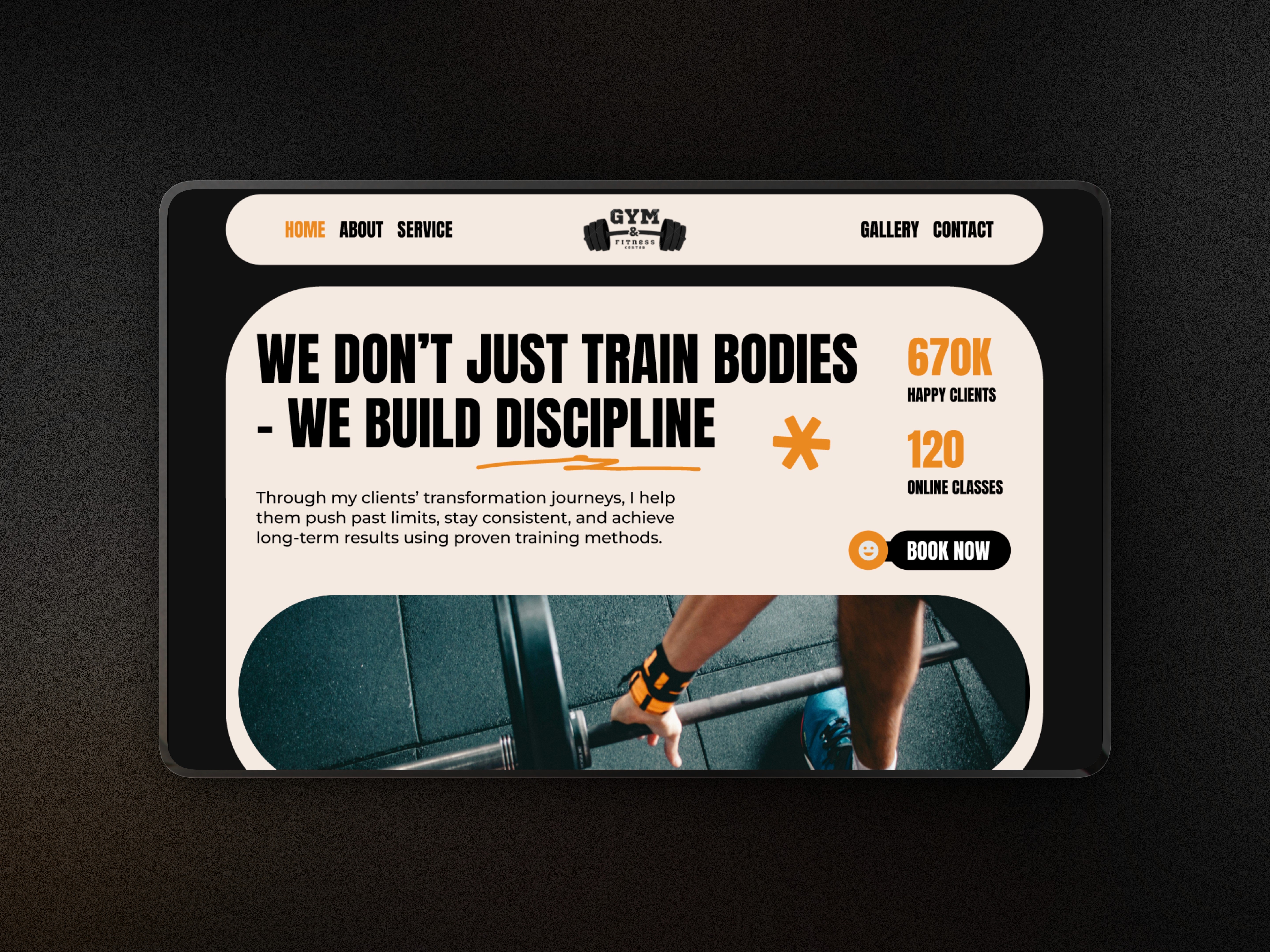
The Solution
The final hero features:
A bold headline that immediately captures attention.
Refined supporting text to guide the user without clutter.
A clean, accessible CTA placed with strong contrast and spacing.
Minimal graphic accents to add depth and maintain a modern feel.
A polished composition that feels spacious, balanced, and premium.
Outcome
This project helped me strengthen my UI instincts and improved my confidence with layout hierarchy, typography, and creating visually strong hero sections. Spectra now serves as an example of my ability to design modern, minimal hero layouts that can be adapted to real-world client projects.
SPECTRA
Overview
Spectra is a personal concept project created to refine my UI design skills and explore modern hero-section layouts. The aim was to design a clean, bold, and visually engaging hero that demonstrates strong hierarchy, balanced spacing, and a premium aesthetic suitable for a digital-first brand.
Project type
Figma Project
Optical Industry
Year
2025
Client
UX Case Study
The Problem
I wanted to challenge myself to create a hero section that feels modern, structured, and instantly impactful. Many beginner hero designs suffer from cluttered layouts, weak hierarchy, and generic visuals. This project allowed me to practice solving those problems through thoughtful UI decisions.
The Goal
Strengthen my ability to design visually strong hero sections.
Focus on typography, spacing, and layout hierarchy.
Build a clean, minimal aesthetic with premium appeal.
Practice creating CTAs that stand out without overpowering the design.
Ensure the design works smoothly across desktop and mobile.
My Approach
I started by defining a simple message and structuring the layout around it. I explored different typographic scales, spacing systems, and layout compositions to create a clear flow for the user. I experimented with subtle gradients and soft geometric shapes to bring depth without crowding the interface.
The design process involved iterating through several wireframes, refining hierarchy, and ensuring that every element had a purpose and visual balance.
The Solution
The final hero features:
A bold headline that immediately captures attention.
Refined supporting text to guide the user without clutter.
A clean, accessible CTA placed with strong contrast and spacing.
Minimal graphic accents to add depth and maintain a modern feel.
A polished composition that feels spacious, balanced, and premium.
Outcome
This project helped me strengthen my UI instincts and improved my confidence with layout hierarchy, typography, and creating visually strong hero sections. Spectra now serves as an example of my ability to design modern, minimal hero layouts that can be adapted to real-world client projects.
What's more :