MODO
Overview
Modo is a personal concept project created to practise designing sleek, modern hero sections with strong visual hierarchy and a product-focused layout.
The goal was to explore how to present a digital product or service in a clean, minimal, and high-impact way while refining my UI layout, spacing, and typography skills.
Project type
Figma Project
Fashton / E-commerce
Year
2025
Client


UX Case Study
The Problem
I wanted to challenge myself to create a hero section that feels product-driven, confident, and visually structured. Many concept hero sections can look flat or generic, lacking emphasis on the core value and failing to guide the user’s attention. This project allowed me to practise building a layout that solves those issues through thoughtful UI decisions.
The Goal
Strengthen my ability to design product-centric hero sections.
Practise building a strong visual hierarchy through clear typography.
Create a layout suitable for SaaS, digital products, or modern services.
Balance informative content with clean, premium aesthetics.
Ensure scalability for both desktop and mobile.
My Approach
I started by defining the key message Modo would highlight and built the layout around clarity and simplicity. I experimented with large, structured headings, clean subtext, and a CTA that stands out through contrast rather than decoration. Visual accents were kept subtle, focusing instead on spacing, alignment, and rhythm.
The process involved sketching different compositions, adjusting the typographic scale, and refining the structure until the layout felt both modern and effortless.
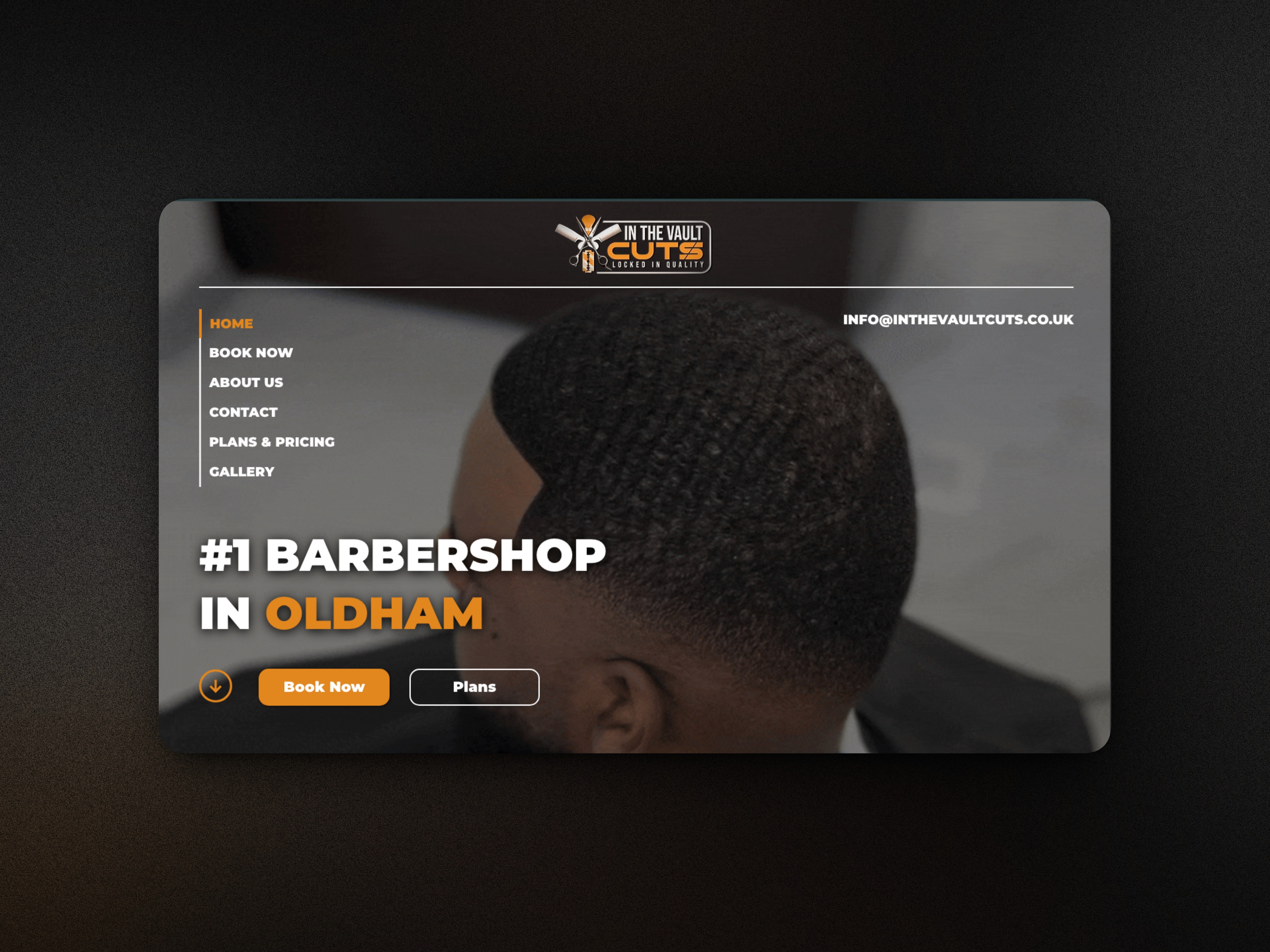
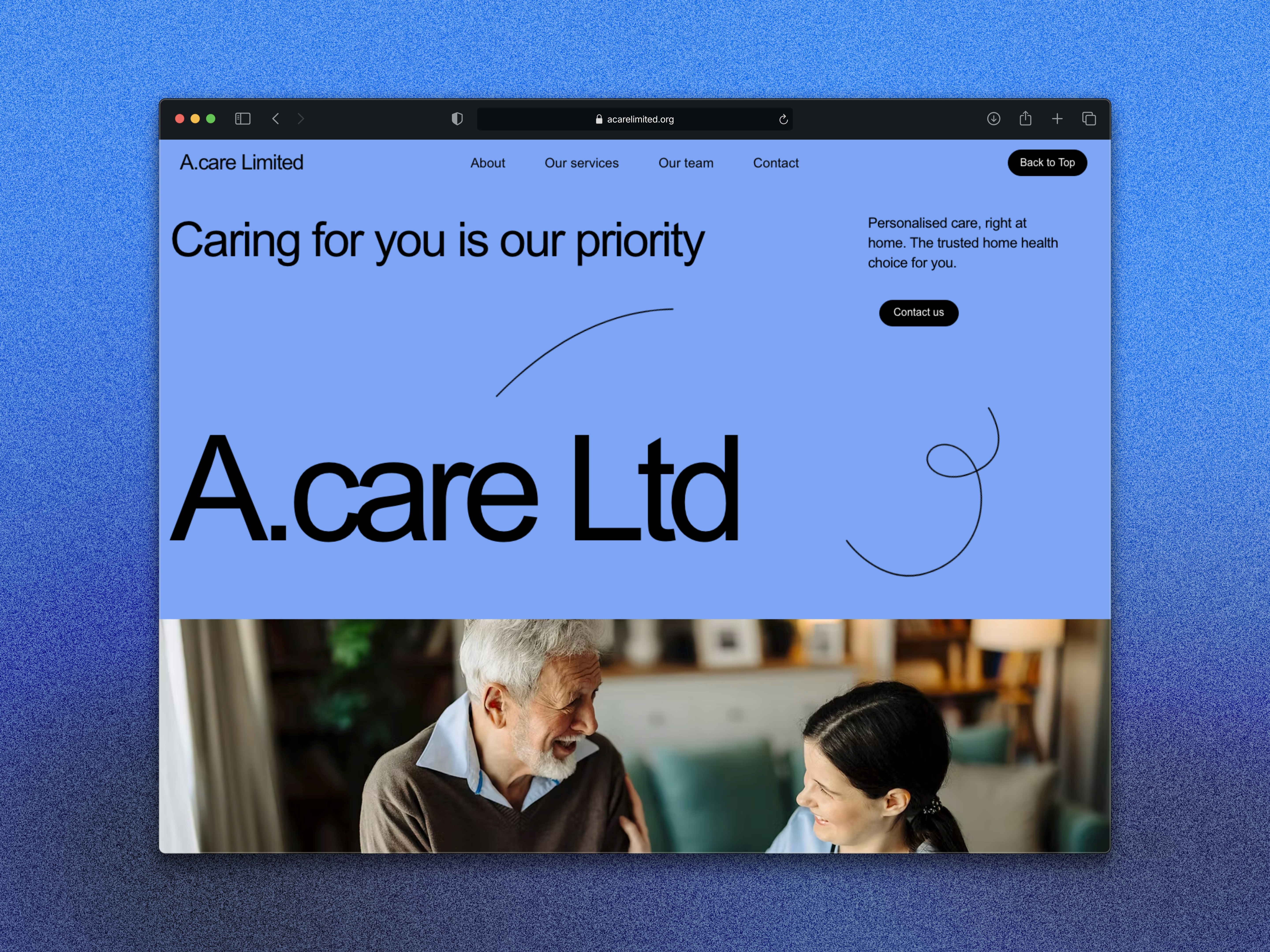
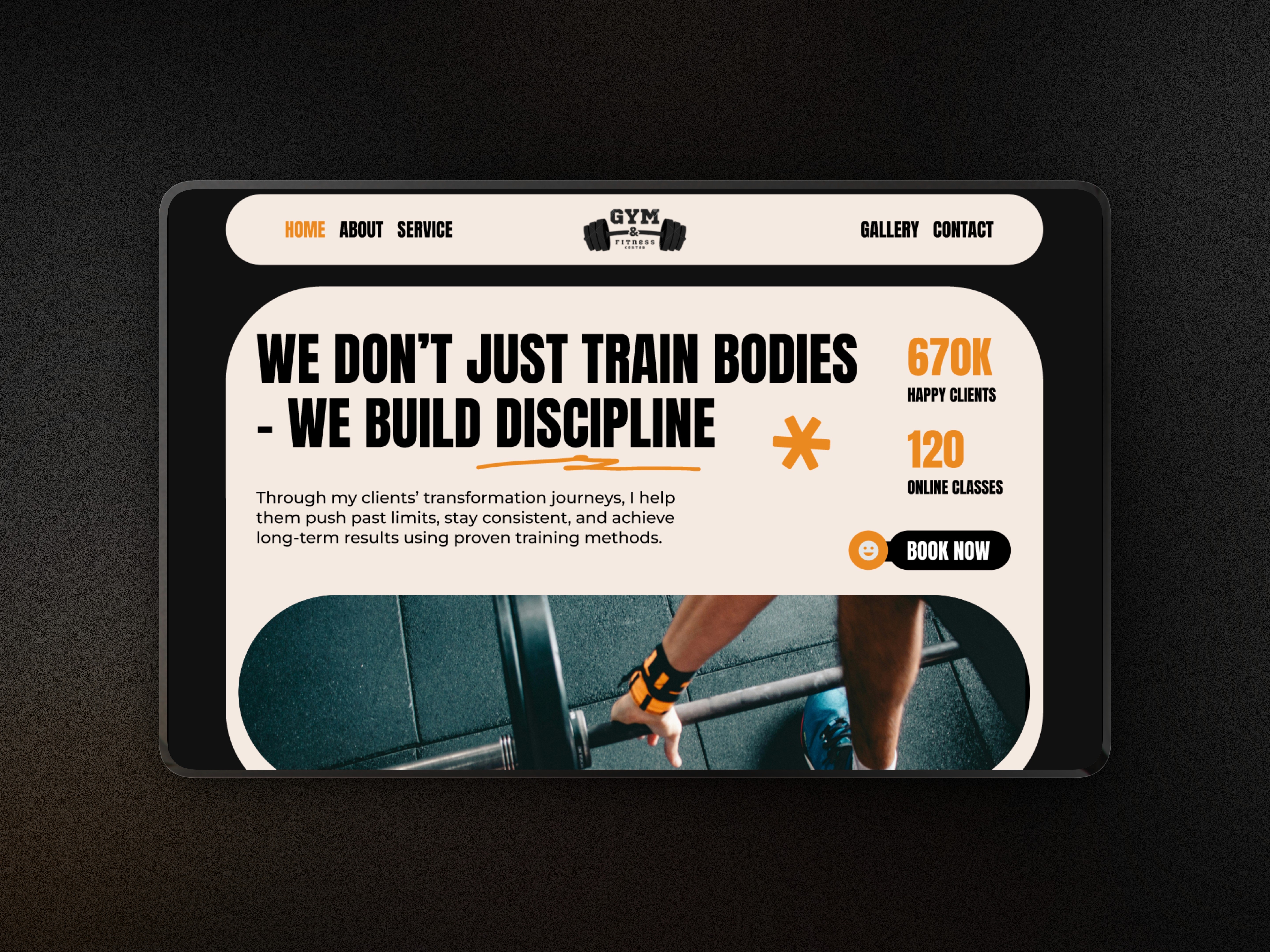
The Solution
The final hero section includes:
A bold, clean headline that sets an instant tone.
Minimal supporting text to explain the purpose without clutter.
A clear call-to-action designed with strong contrast.
A balanced layout built around spacing, alignment, and simplicity.
Subtle graphic elements that add polish without overwhelming the UI.
The result is a modern, flexible hero section that could easily be adapted for a real product or startup.
Outcome
This project helped me improve my ability to create structured, product-focused hero layouts with a premium aesthetic. It strengthened my skills in hierarchy, layout design, CTA placement, and building clean, modern visual systems.
MODO
Overview
Modo is a personal concept project created to practise designing sleek, modern hero sections with strong visual hierarchy and a product-focused layout.
The goal was to explore how to present a digital product or service in a clean, minimal, and high-impact way while refining my UI layout, spacing, and typography skills.
Project type
Figma Project
Fashton / E-commerce
Year
2025
Client
UX Case Study
The Problem
I wanted to challenge myself to create a hero section that feels product-driven, confident, and visually structured. Many concept hero sections can look flat or generic, lacking emphasis on the core value and failing to guide the user’s attention. This project allowed me to practise building a layout that solves those issues through thoughtful UI decisions.
The Goal
Strengthen my ability to design product-centric hero sections.
Practise building a strong visual hierarchy through clear typography.
Create a layout suitable for SaaS, digital products, or modern services.
Balance informative content with clean, premium aesthetics.
Ensure scalability for both desktop and mobile.
My Approach
I started by defining the key message Modo would highlight and built the layout around clarity and simplicity. I experimented with large, structured headings, clean subtext, and a CTA that stands out through contrast rather than decoration. Visual accents were kept subtle, focusing instead on spacing, alignment, and rhythm.
The process involved sketching different compositions, adjusting the typographic scale, and refining the structure until the layout felt both modern and effortless.
The Solution
The final hero section includes:
A bold, clean headline that sets an instant tone.
Minimal supporting text to explain the purpose without clutter.
A clear call-to-action designed with strong contrast.
A balanced layout built around spacing, alignment, and simplicity.
Subtle graphic elements that add polish without overwhelming the UI.
The result is a modern, flexible hero section that could easily be adapted for a real product or startup.
Outcome
This project helped me improve my ability to create structured, product-focused hero layouts with a premium aesthetic. It strengthened my skills in hierarchy, layout design, CTA placement, and building clean, modern visual systems.
What's more :