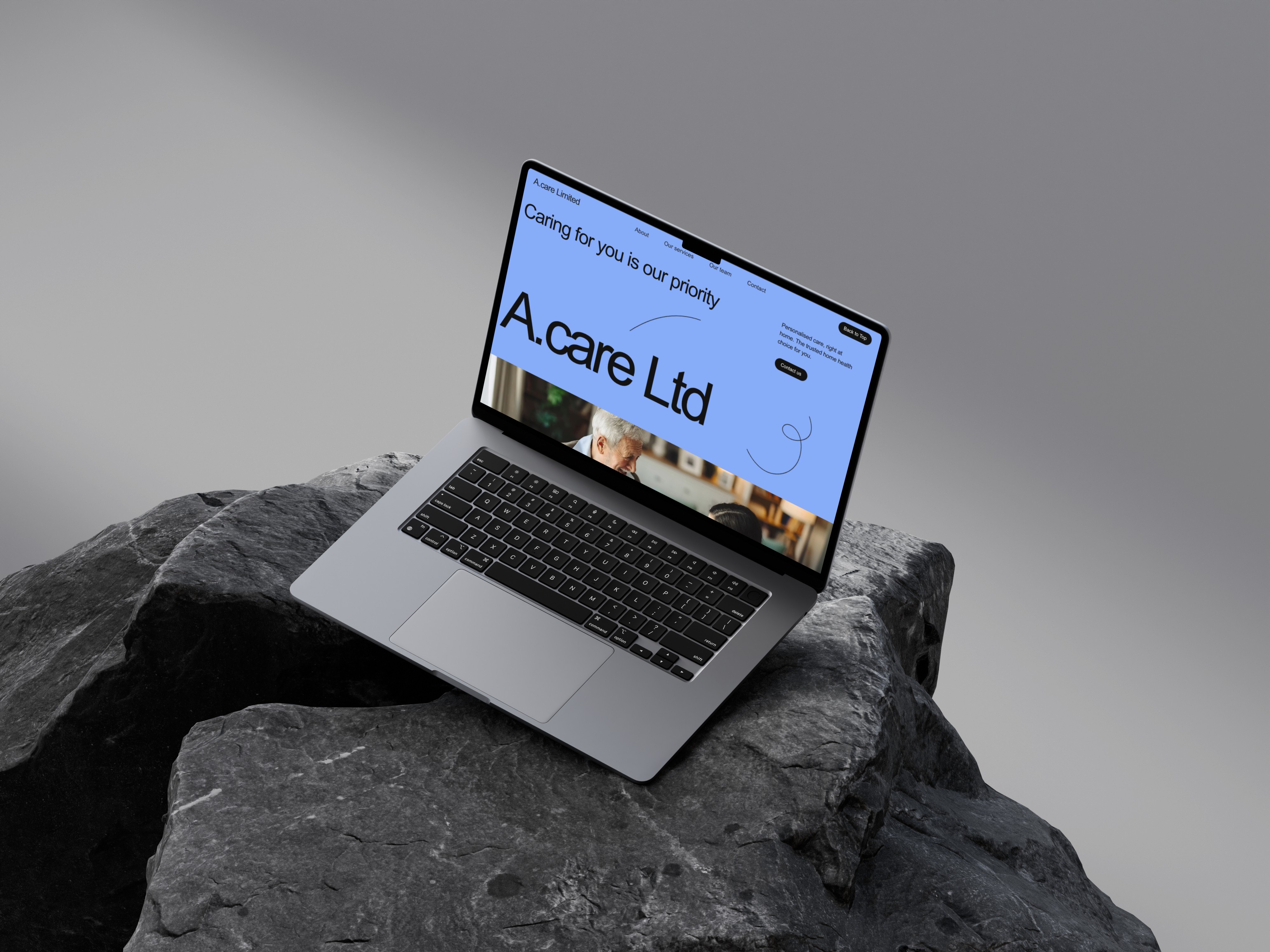
PT LANDING PAGE
Overview
This project is a personal concept landing page created to strengthen my UI/UX design skills, specifically focusing on layout hierarchy, visual storytelling, and creating high-energy branding for service-based businesses.
The goal was to design a bold, conversion-driven page for a fitness trainer, combining strong visuals with clear messaging and user-focused navigation.
Project type
Figma Project
Fitness
Year
2025
Client


UX Case Study
The Problem
Fitness landing pages often lack structure, clarity, and strong calls to action. Many feel cluttered, outdated, or fail to communicate the trainer’s value in a compelling way. I wanted to challenge myself to create a design that feels modern, motivating, and trustworthy — the type of landing page that converts visitors into clients.
The Goal
Build a bold, engaging hero section that immediately communicates the trainer’s mission.
Create clear, structured content sections that guide users through the journey:
Who they are → What they offer → How to get started.Use strong imagery and colour psychology to motivate action.
Design a layout that works for both mobile and desktop users.
Practise turning a service business into a visually consistent digital brand.
My Approach
I started by defining a clear message for the hero section: discipline, mindset, and transformation. From there, I created a layout that uses bold typography, strong contrast, rounded card components, and bright accents to showcase the trainer’s energy and credibility.
Each section was designed with a specific purpose:
Hero: Bold message, key stats, clear CTA (“Book Now”).
Training Categories: Simple tabs to explore programmes.
Fitness Journey: Explains the structure with supporting visuals.
Meet Your Coach: Adds trust and personality.
Service Benefits: Easy-to-scan, icon-led cards.
Coaching Options: Side-by-side comparison for quick decision-making.
Membership Pricing: Structured pricing layout to encourage conversions.
Social Proof & Social Links: Human, relatable imagery to build trust.
Newsletter CTA: Clean closing section to keep users engaged.
I used a bold orange accent to symbolise energy and discipline, paired with black for strength and contrast.
The Solution
The final landing page features:
High-impact typography to create a motivating tone.
Strong visual hierarchy that guides the user naturally.
Rounded components for a modern, web-friendly aesthetic.
Conversion-driven CTAs placed strategically throughout.
A consistent colour system reinforcing fitness and discipline.
Clean service breakdowns that make the offering easy to understand.
A structured pricing plan to help users make quick decisions.
Outcome
This project helped me reinforce key UI/UX skills, including layout composition, responsive thinking, colour usage, and designing for conversion. It also expanded my ability to build visually strong landing pages for service-based brands — a skill directly transferable to client work.
It now serves as a showcase piece in my portfolio demonstrating my approach to designing high-impact, modern landing pages with a strong visual narrative.
What's more :


