LOOPIN
Overview
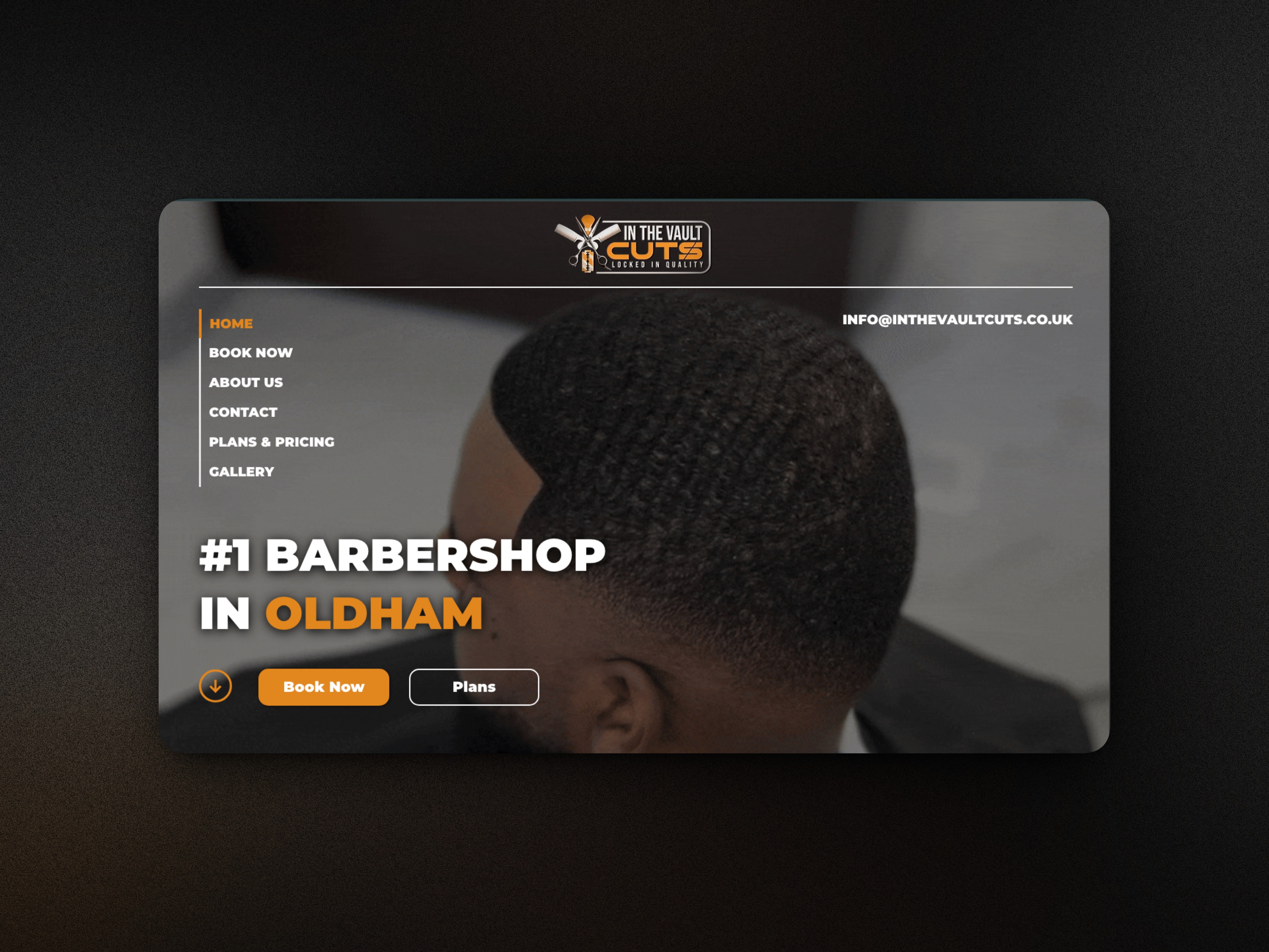
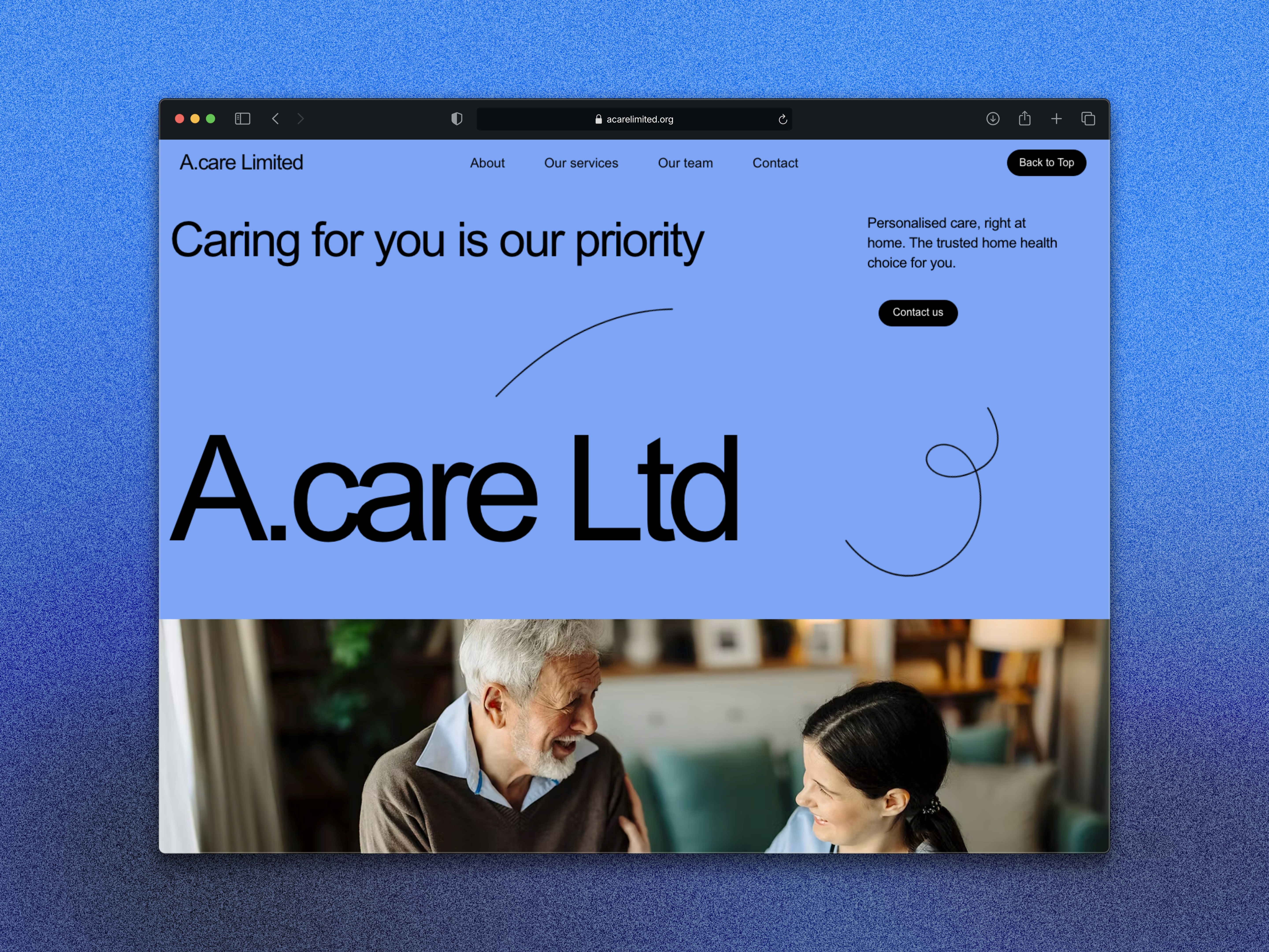
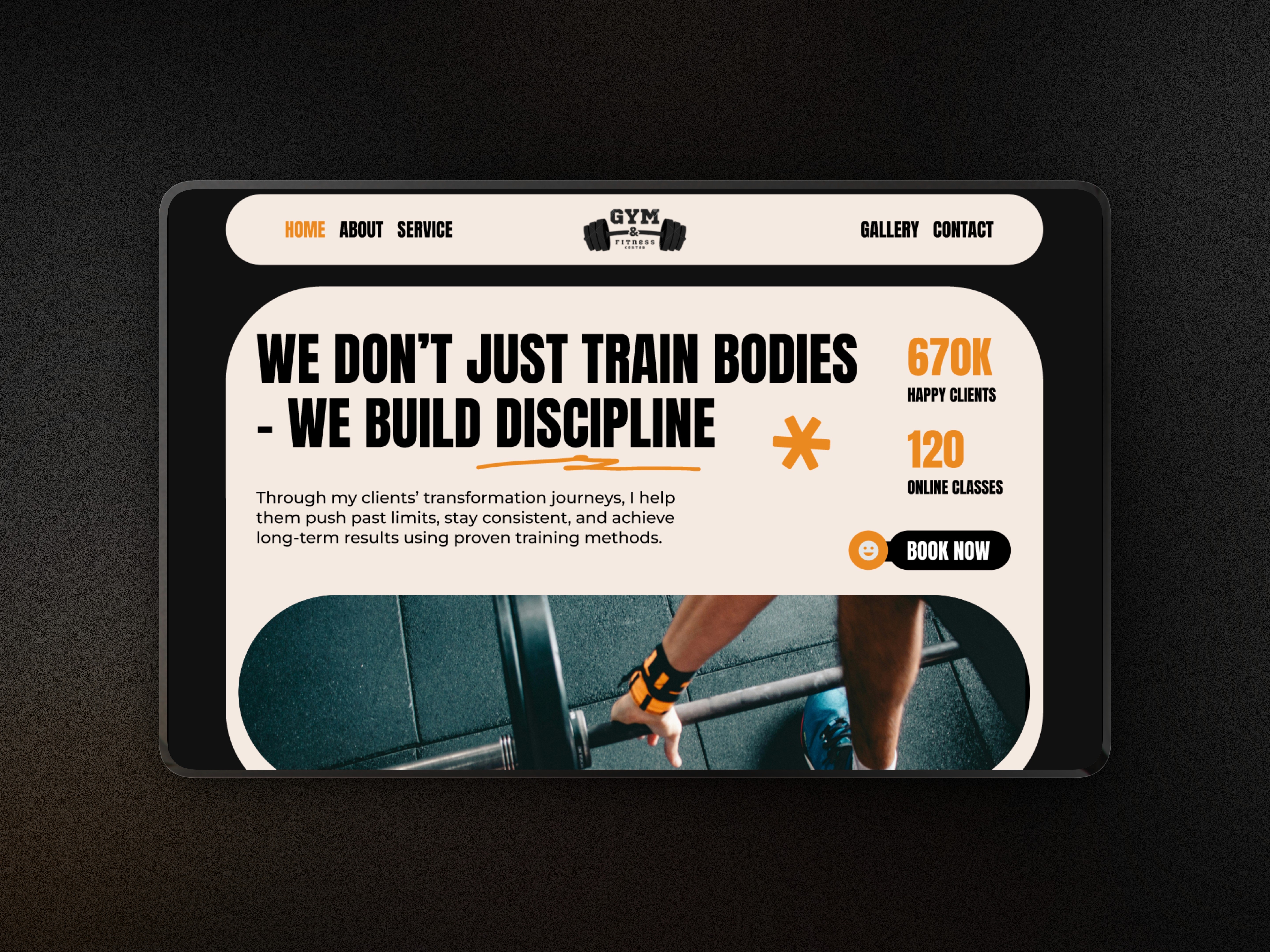
Loopin is a personal concept project exploring how a digital platform can help people connect, share interests, and build genuine communities. I designed a clean, modern interface focused on simplicity, trust, and seamless interaction. The goal was to practise UI/UX fundamentals such as system structure, component design, onboarding flow, and community-driven user journeys.
Project type
Figma Project
Social Media
Year
2025
Client


UX Case Study
The Problem
Many community platforms feel cluttered, overwhelming, or too feature-heavy, causing users to lose interest quickly. They often lack a clear entry point or fail to create a sense of belonging. I wanted to design a concept that solves these issues—an app that feels intuitive, friendly, and purpose-driven from the moment a user lands on it.
The Goal
Create a friendly, modern hero section that clearly introduces the platform’s purpose.
Develop a layout that highlights community, connection, and shared interests.
Practise scalable UI patterns that could expand into a full app experience.
Explore a soft, clean visual identity that supports communication and collaboration.
Strengthen my product thinking around community-led digital experiences.
My Approach
I started by defining the core message of the platform: bringing people together through shared interests.
From there, I focused on clarity, white space, and a calm visual tone to encourage trust and approachability.
Key design decisions included:
A simple and uplifting hero message to set the tone.
Soft, rounded components to make the interface feel welcoming.
Clean typography and balanced spacing for easy reading.
Visual elements that highlight user groups, activities, and shared spaces.
A layout designed to scale into full app pages such as groups, events, chat, and profiles.
The Solution
The final design features:
A clear hero section introducing Loopin as a space to connect and participate.
Soft colours and modern UI elements to support a calm, community-first experience.
Strong visual hierarchy guiding users from introduction to action.
Expandable components that hint at future features (groups, events, activities).
A structure that supports both new users and returning members.
The result is a clean, intuitive foundation for a community platform that feels modern and accessible.
Outcome
This concept helped me develop my skills in app layout design, digital communities, and UX flow planning. Loopin now serves as a strong portfolio piece demonstrating my ability to design friendly, user-centred interfaces for community and social platforms.
LOOPIN
Overview
Loopin is a personal concept project exploring how a digital platform can help people connect, share interests, and build genuine communities. I designed a clean, modern interface focused on simplicity, trust, and seamless interaction. The goal was to practise UI/UX fundamentals such as system structure, component design, onboarding flow, and community-driven user journeys.
Project type
Figma Project
Social Media
Year
2025
Client
UX Case Study
The Problem
Many community platforms feel cluttered, overwhelming, or too feature-heavy, causing users to lose interest quickly. They often lack a clear entry point or fail to create a sense of belonging. I wanted to design a concept that solves these issues—an app that feels intuitive, friendly, and purpose-driven from the moment a user lands on it.
The Goal
Create a friendly, modern hero section that clearly introduces the platform’s purpose.
Develop a layout that highlights community, connection, and shared interests.
Practise scalable UI patterns that could expand into a full app experience.
Explore a soft, clean visual identity that supports communication and collaboration.
Strengthen my product thinking around community-led digital experiences.
My Approach
I started by defining the core message of the platform: bringing people together through shared interests.
From there, I focused on clarity, white space, and a calm visual tone to encourage trust and approachability.
Key design decisions included:
A simple and uplifting hero message to set the tone.
Soft, rounded components to make the interface feel welcoming.
Clean typography and balanced spacing for easy reading.
Visual elements that highlight user groups, activities, and shared spaces.
A layout designed to scale into full app pages such as groups, events, chat, and profiles.
The Solution
The final design features:
A clear hero section introducing Loopin as a space to connect and participate.
Soft colours and modern UI elements to support a calm, community-first experience.
Strong visual hierarchy guiding users from introduction to action.
Expandable components that hint at future features (groups, events, activities).
A structure that supports both new users and returning members.
The result is a clean, intuitive foundation for a community platform that feels modern and accessible.
Outcome
This concept helped me develop my skills in app layout design, digital communities, and UX flow planning. Loopin now serves as a strong portfolio piece demonstrating my ability to design friendly, user-centred interfaces for community and social platforms.
What's more :