Barbershop Locator
Overview
This was a personal concept project designed to improve my mobile UI/UX skills by creating an app that helps users quickly locate nearby barbershops. The goal was to explore clean navigation, a modern visual style, and a seamless user journey from discovery to booking.
Project type
Mobile App
Personal Care
Year
2025
Client


UX Case Study
The Problem
Finding a reliable barbershop can be difficult—most people rely on word of mouth, scattered Google results, or outdated listings. There’s often no central place to compare services, see reviews, or check availability. This concept tackles that gap with a simple, user-friendly interface.
The Goal
Create a bold hero screen with clear intent: locate a barbershop near you.
Build an organised, easy-to-browse home screen.
Showcase salons with ratings, pricing, and offers at a glance.
Explore a modern, dark UI style with strong visual hierarchy.
Strengthen my mobile design workflow and component consistency.
My Approach
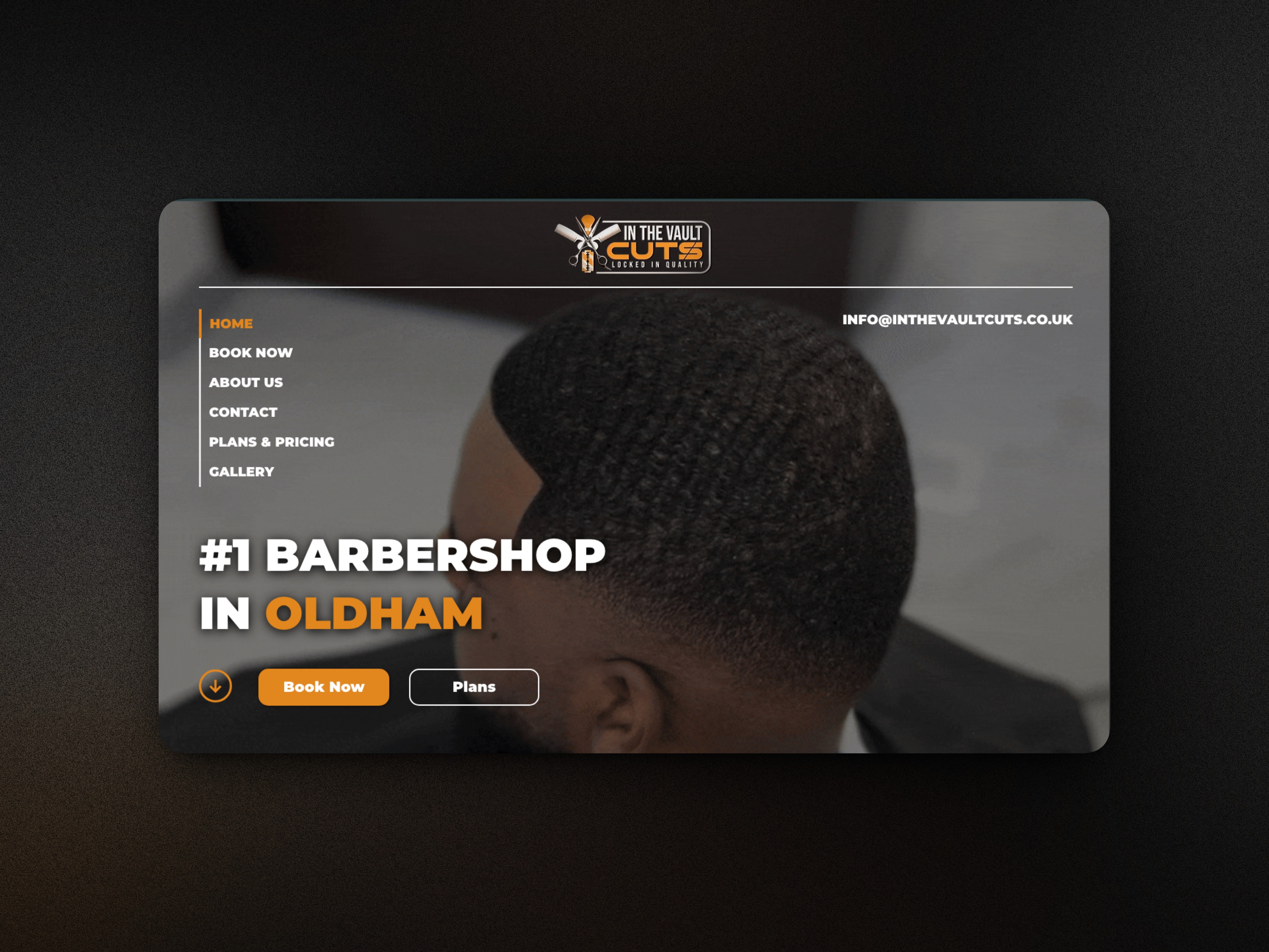
I started by focusing on clarity. The hero screen uses large typography and a strong visual to communicate purpose immediately.
The home dashboard prioritises quick filtering, personalised greetings, and simple navigation.
Key design decisions:
Large, readable hero text for instant direction.
A rounded CTA button to drive the first interaction.
A clean search bar and category filters for fast exploration.
Card-based listings with images, ratings, and prices to boost discoverability.
A dark, cool-toned palette to give the app a sharp, premium feel.
The Solution
The final design offers:
A direct, intuitive landing experience.
Smooth hierarchy across search, offers, and nearby salons.
A layout that encourages quick scanning and decision-making.
Components that could easily scale into booking flows, profiles, reviews, and maps.
Outcome
This project helped refine my skills in mobile interface design, typography, colour systems, and structured app layouts. It also serves as a strong portfolio piece demonstrating my ability to design practical, location-based digital products with a modern and user-centred approach.
Barbershop Locator
Overview
This was a personal concept project designed to improve my mobile UI/UX skills by creating an app that helps users quickly locate nearby barbershops. The goal was to explore clean navigation, a modern visual style, and a seamless user journey from discovery to booking.
Project type
Mobile App
Personal Care
Year
2025
Client
UX Case Study
The Problem
Finding a reliable barbershop can be difficult—most people rely on word of mouth, scattered Google results, or outdated listings. There’s often no central place to compare services, see reviews, or check availability. This concept tackles that gap with a simple, user-friendly interface.
The Goal
Create a bold hero screen with clear intent: locate a barbershop near you.
Build an organised, easy-to-browse home screen.
Showcase salons with ratings, pricing, and offers at a glance.
Explore a modern, dark UI style with strong visual hierarchy.
Strengthen my mobile design workflow and component consistency.
My Approach
I started by focusing on clarity. The hero screen uses large typography and a strong visual to communicate purpose immediately.
The home dashboard prioritises quick filtering, personalised greetings, and simple navigation.
Key design decisions:
Large, readable hero text for instant direction.
A rounded CTA button to drive the first interaction.
A clean search bar and category filters for fast exploration.
Card-based listings with images, ratings, and prices to boost discoverability.
A dark, cool-toned palette to give the app a sharp, premium feel.
The Solution
The final design offers:
A direct, intuitive landing experience.
Smooth hierarchy across search, offers, and nearby salons.
A layout that encourages quick scanning and decision-making.
Components that could easily scale into booking flows, profiles, reviews, and maps.
Outcome
This project helped refine my skills in mobile interface design, typography, colour systems, and structured app layouts. It also serves as a strong portfolio piece demonstrating my ability to design practical, location-based digital products with a modern and user-centred approach.
What's more :